Channeling the spirit of the awe-inspiring experiential spectacle of the IBM Pavilion at the 1964 World’s Fair, SYPartners forged a creative partnership with Mirada to design a new, expansive, multi-platform interactive exhibit that would chronicle some of the great discoveries, inventions, trials, errors, and triumphs that have paved humanity's long road to improving the way we live and function, and show how such significant advances—how humans go about accomplishing them—tend to follow the same distinct, repeatable pattern of progress. Just as importantly, the exhibit strove to highlight pivotal present-day advances, innovators, and future trends born of these centuries of scientific progress.
The overall exhibit experience was designed and constructed to flow seamlessly, taking audiences through three unique consecutive stages – a fluid three-act structure, if you will: 1) a massive exterior data visualization wall; 2) a 14-minute, fully immersive, "multiple-surround-screen" film; and 3) a final "deep dive" learning segment, wherein audiences could engage with, and navigate their own way through, countless aspects of the history and future of human science via giant interactive touch screens.
Act 1: The Data Wall Intro
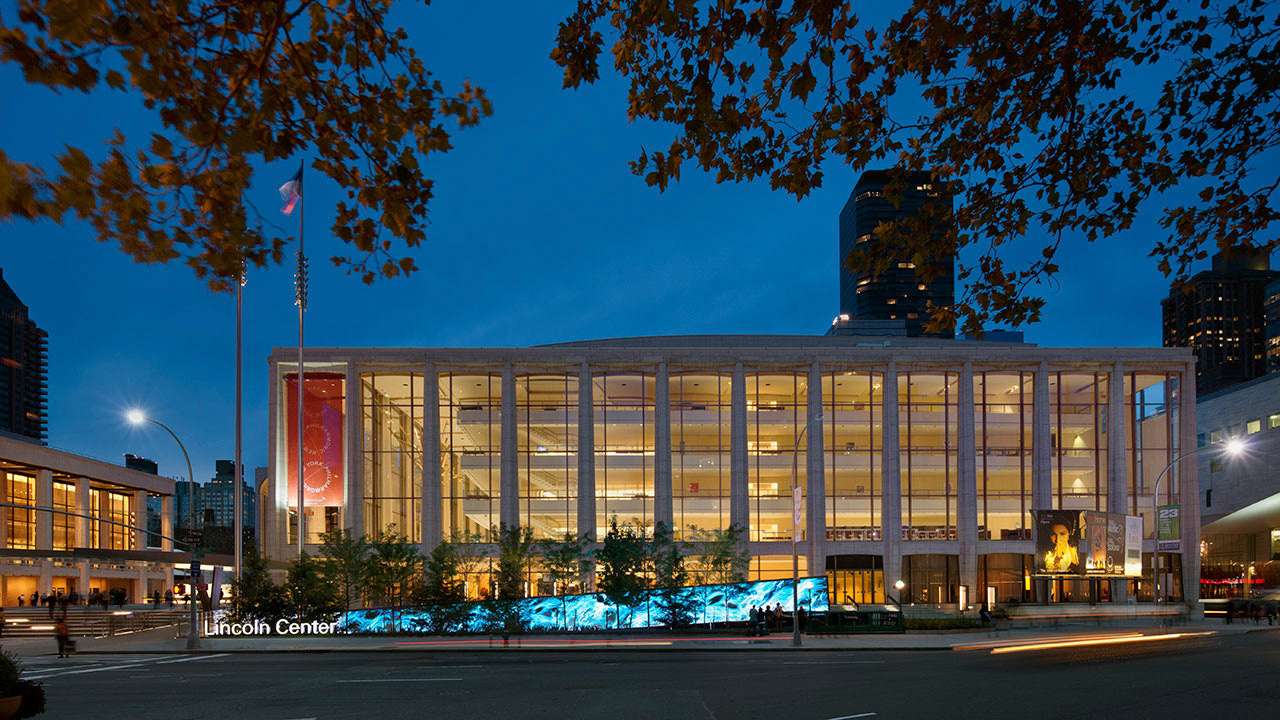
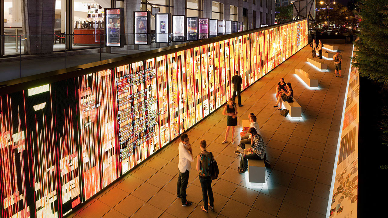
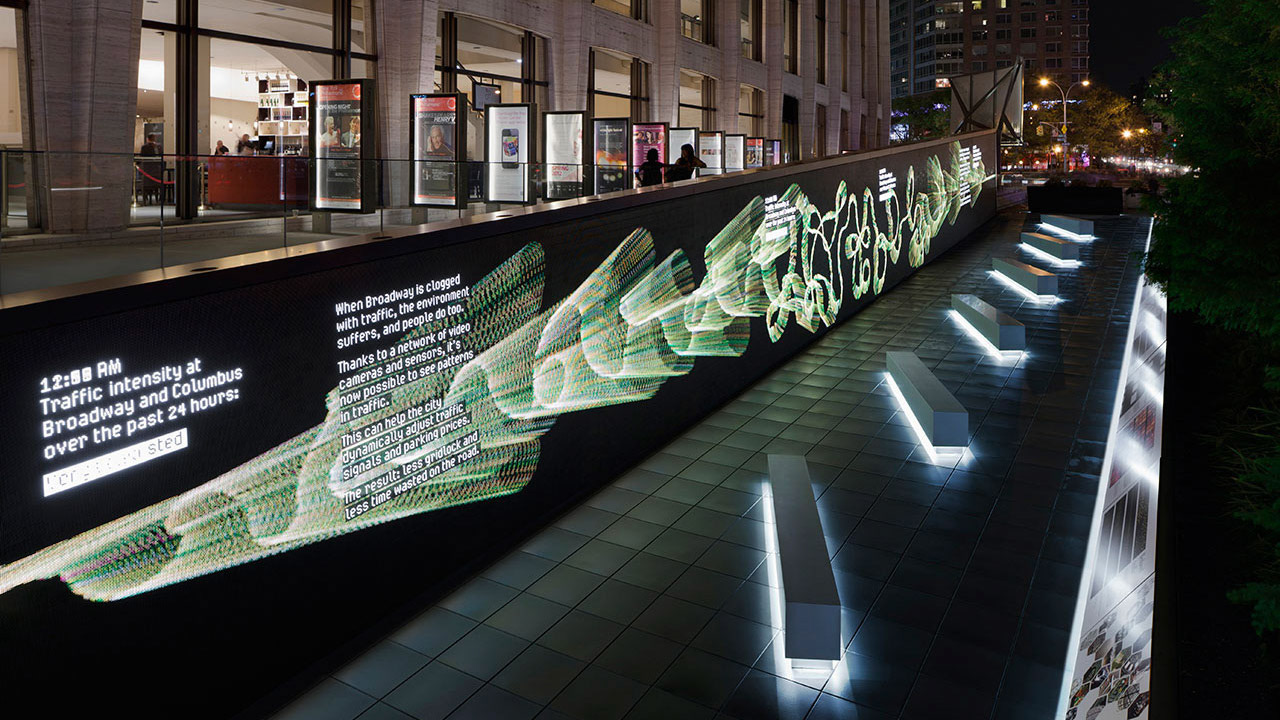
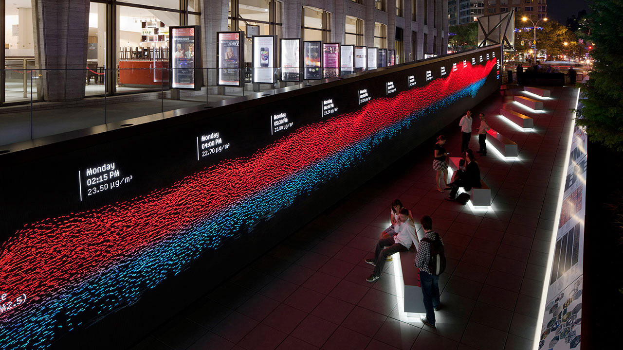
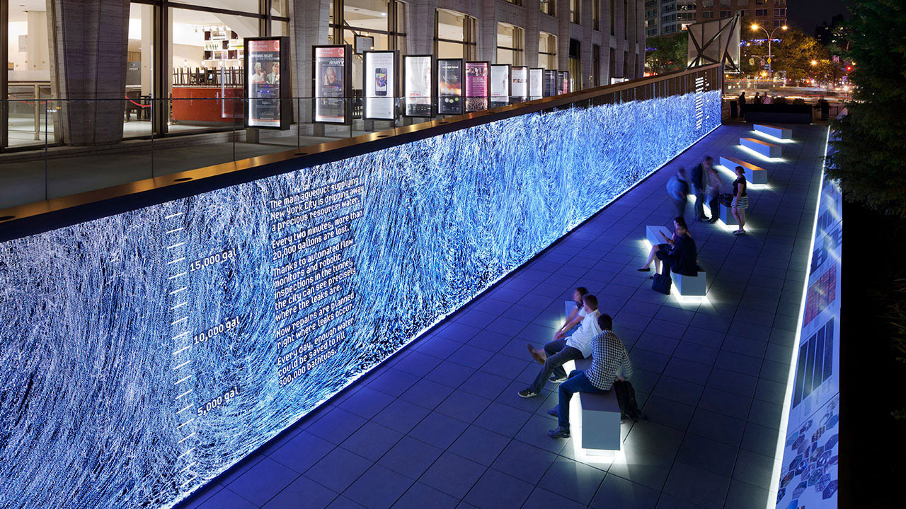
Visitors approaching the exhibit were drawn in by a 123-foot long digital wall: a giant "widescreen" display with flowing generative art patterns and real-time streaming data visualizations—showing traffic flow, solar energy, air quality, water usage, and even fraudulent credit card transactions—these graphic analyses all drawn from the viewer’s surrounding NYC environment. Visitors, and all passers-by on the street in general, could see and comprehend, with astounding visual clarity, how we are now able to analyze and predict complex systems-in-motion, and apply this knowledge to improving efficiency and resource management – not just in New York, but in places all around the world. The long sloping data wall and its relaxed, open viewing area were built on a gradually inclined ramp that guided audiences naturally into the next stage of their journey...
Act 2: The Immersive Film
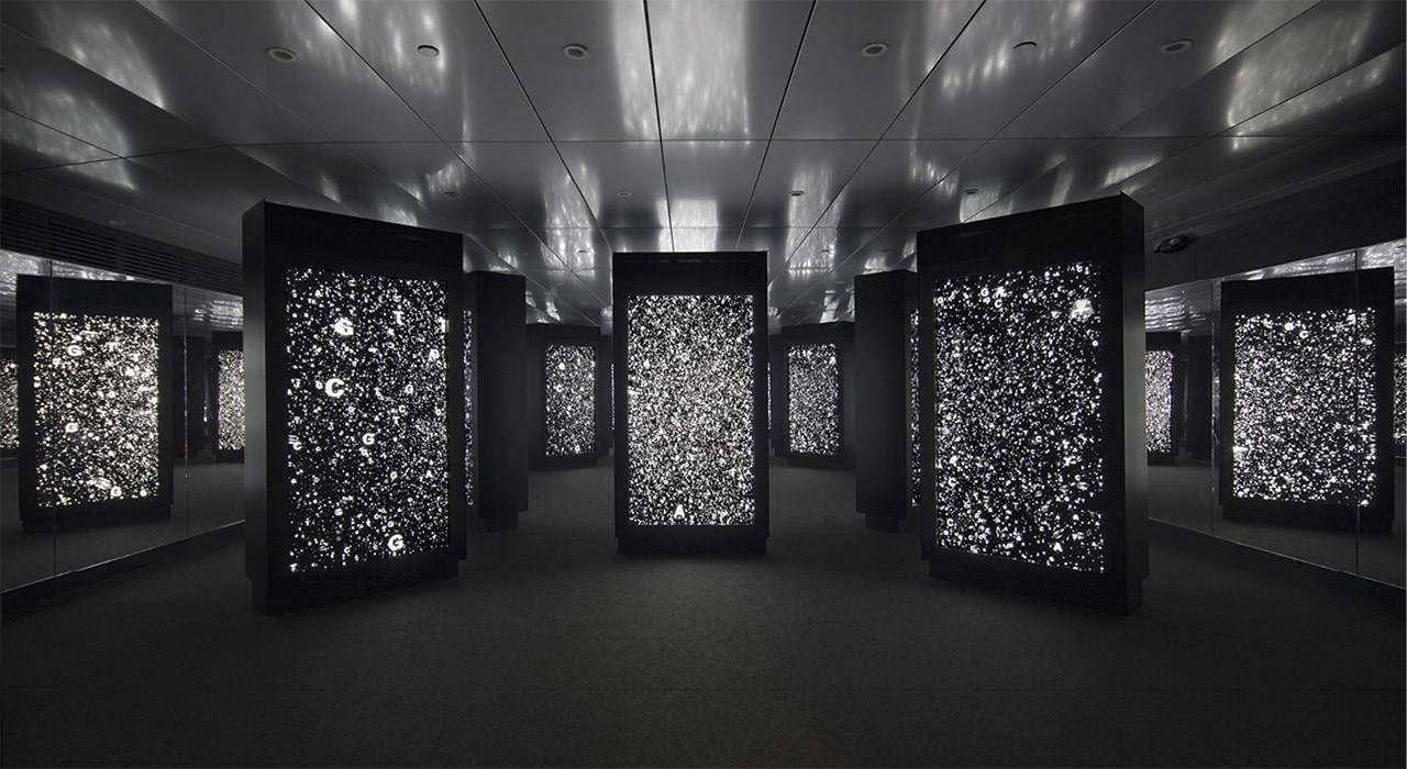
Visitors then entered a dynamic, dimensional theater space: a "media field" composed of 20 precisely arranged, seven feet tall, double-sided video panels – amounting to 40 viewing screens in total. Imagine a series of several interconnected, six-faceted Stonehenges, wherein each henge/ring's six "standing stones" are giant iPhone-like "medialiths" that surround the audience from all angles in arcing arrays, with layers of depth, parallax, and reflections off the mirrored walls. A streaming, kaleidoscopic 14-minute immersive film enveloped the audience, literally placing them inside the story. The interplay of imagery and sound—flowing one panel to the next, encircling the audience—charted the paths and recurring patterns of human progress, and challenged viewers to look to the future and imagine the next great steps we could take toward improving our world...
Act 3: The Interactive "Deep Dives"
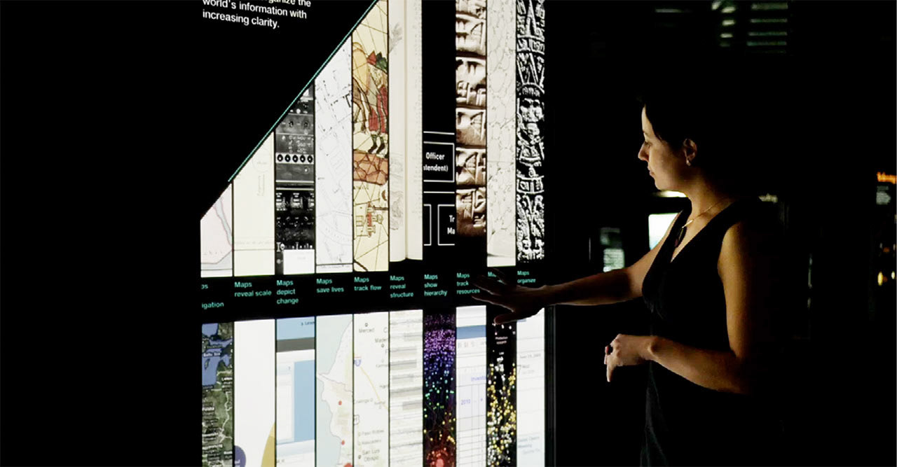
By design, the Immersive Film acts as a primer for visitors, inviting them into the interactive experience that follows. The 40 seven-foot media panels in the space become interactive touch screens, transforming the environment into a panopticon of discovery. Visitors trace the steps in our quest to see more of our world – from clocks and scales, to RFID chips and biomedical sensors. They learn how mapping can be used to track data, from the earliest maps to cutting-edge databases and data visualization. They stand—quite literally—face-to-face with leaders in world-changing initiatives who share how they built belief. The touch screens even grant visitors an opportunity to share their own perspectives and see what others think.
The Result: A Streaming Synthesis of Knowledge and Art
Epilogue: The Apps
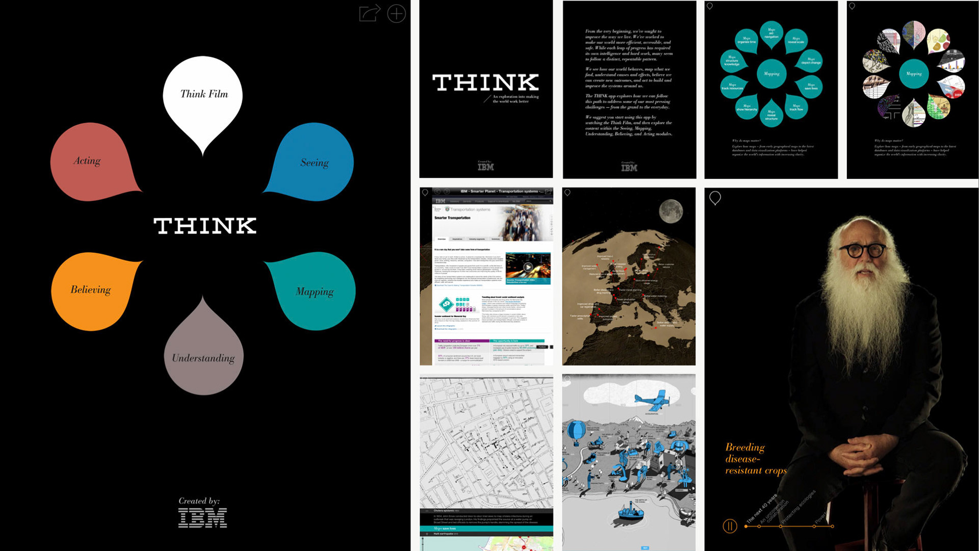
IBM also enlisted Mirada to bring the THINK Exhibit experience to both iPad and Android tablet users.
Within a four-month timeline, the whole of the experience was redesigned and optimized for mobile. The immersive film portion was reimagined as a single screen, nine-minute, HD version, and the interactive "deep dives" were distinctly coded—in parallel—for both Android and iOS. Over 850MB of content was designed to be remotely and dynamically updateable to ensure that the stories-in-progress track technology’s most recent developments. To further expand the audience, Mirada included the ability to post features of the app on social media—including Facebook and Twitter—and a unique educational curriculum was developed and freely distributed to high schools across the US and abroad.
The day after its release, IBM THINK was selected by Apple as a "New and Noteworthy" app and was downloaded more than 275,000 times in 2012 alone.
AWARDS
ADC (Interactive / Physical Installation): Won Gold Cube award & audience award
AICP / NEXT: Won Next Integrated Campaign award & Next Experiential award
IDSA: Won the IDSA gold award
One Show Entertainment: Won the gold pencil
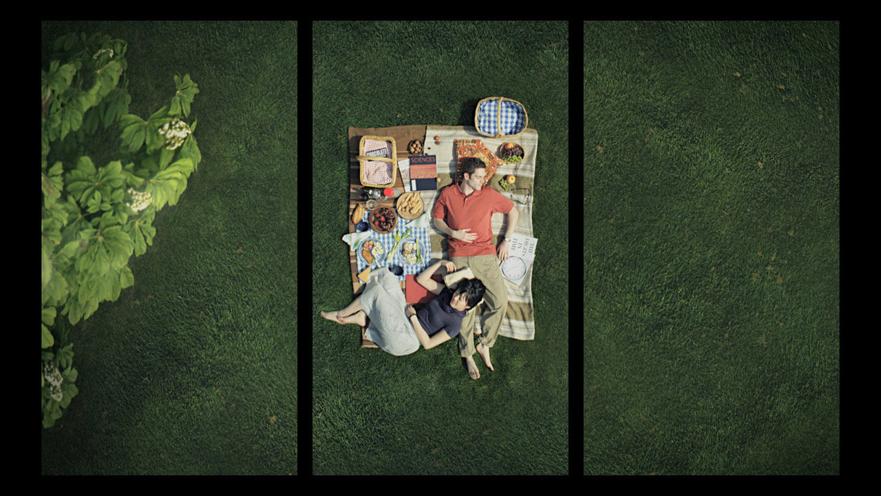
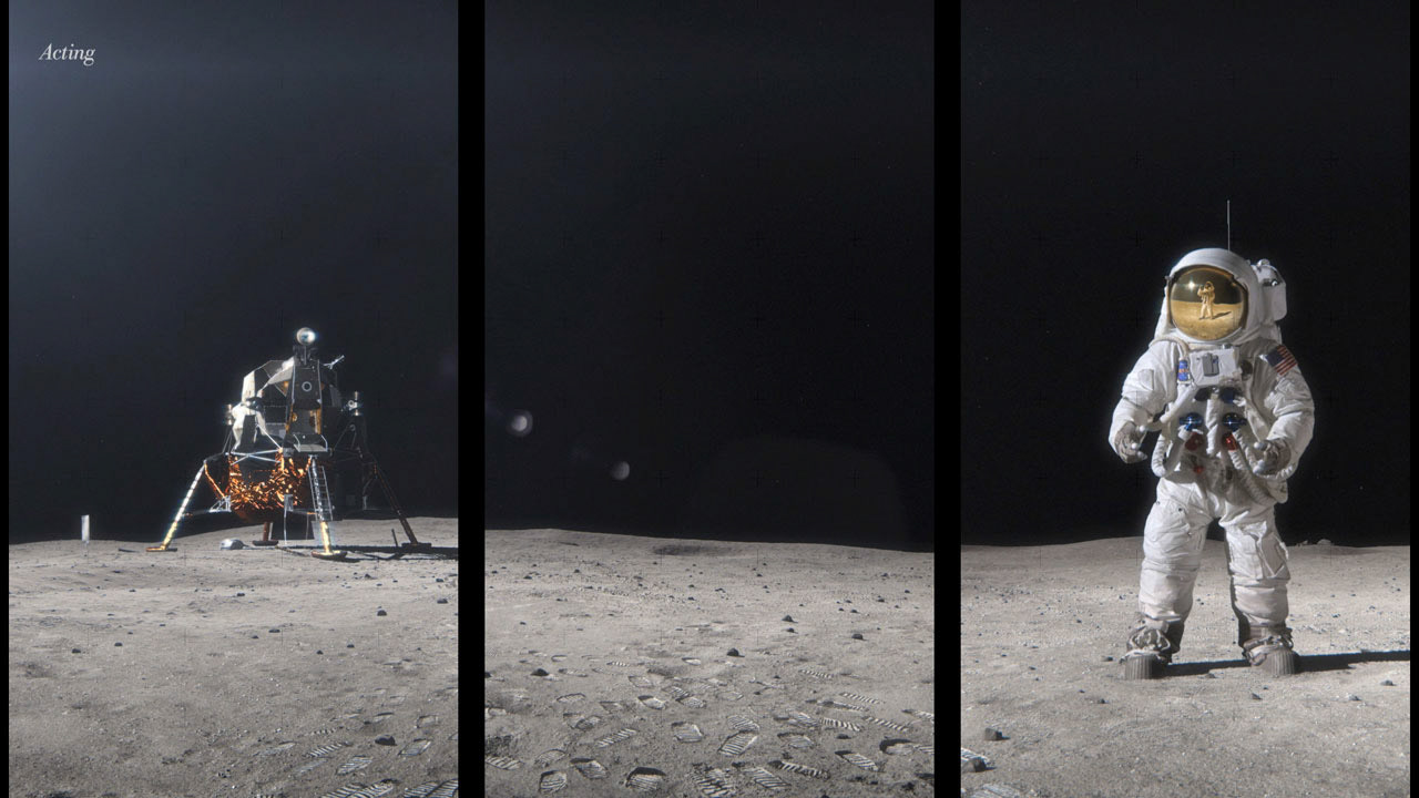
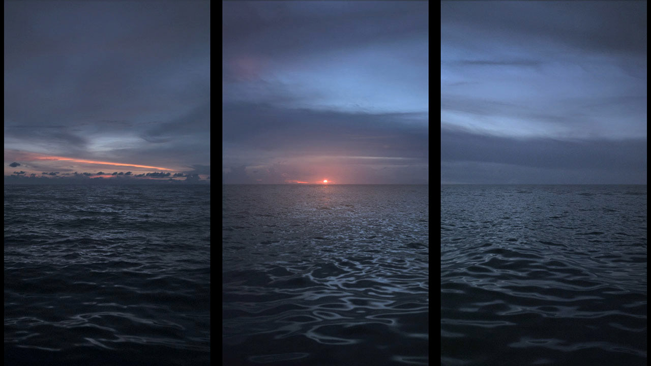
Experienced as a whole, the three phases of the THINK Exhibit formed a single cerebrally and aesthetically cohesive narrative – its story arc and impact unimpeded by any actual IBM branding. In creating this experience, Mirada captured over 100 hours of footage in seven countries, and wove the dramatic visuals, interviews, and data together via contiguous three-screen clusters—cinematic triptychs—that transported visitors to distant places and new levels of understanding.
